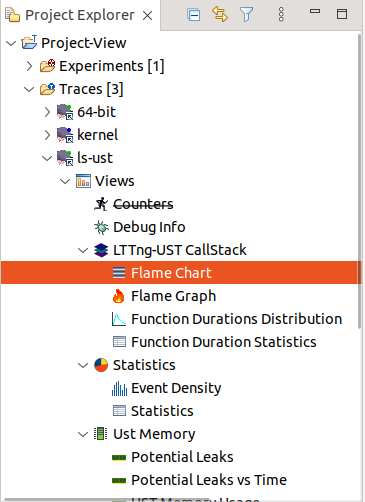
LTTng Tracer and Trace Compass
LTTng Tracer Control is a component of the LTTng ecosystem designed to manage and control tracing in a Linux system. It provides a set of to ols and interface for controlling and configuring traces, which are the components reponsible for collecting trace data (system events and logs) from various sources in the system.
To start working with LTTng Tracer Control, please refer to LTTng Trace Control Linux Project.
View and Analysis trace data with Linux user space and kernel trace
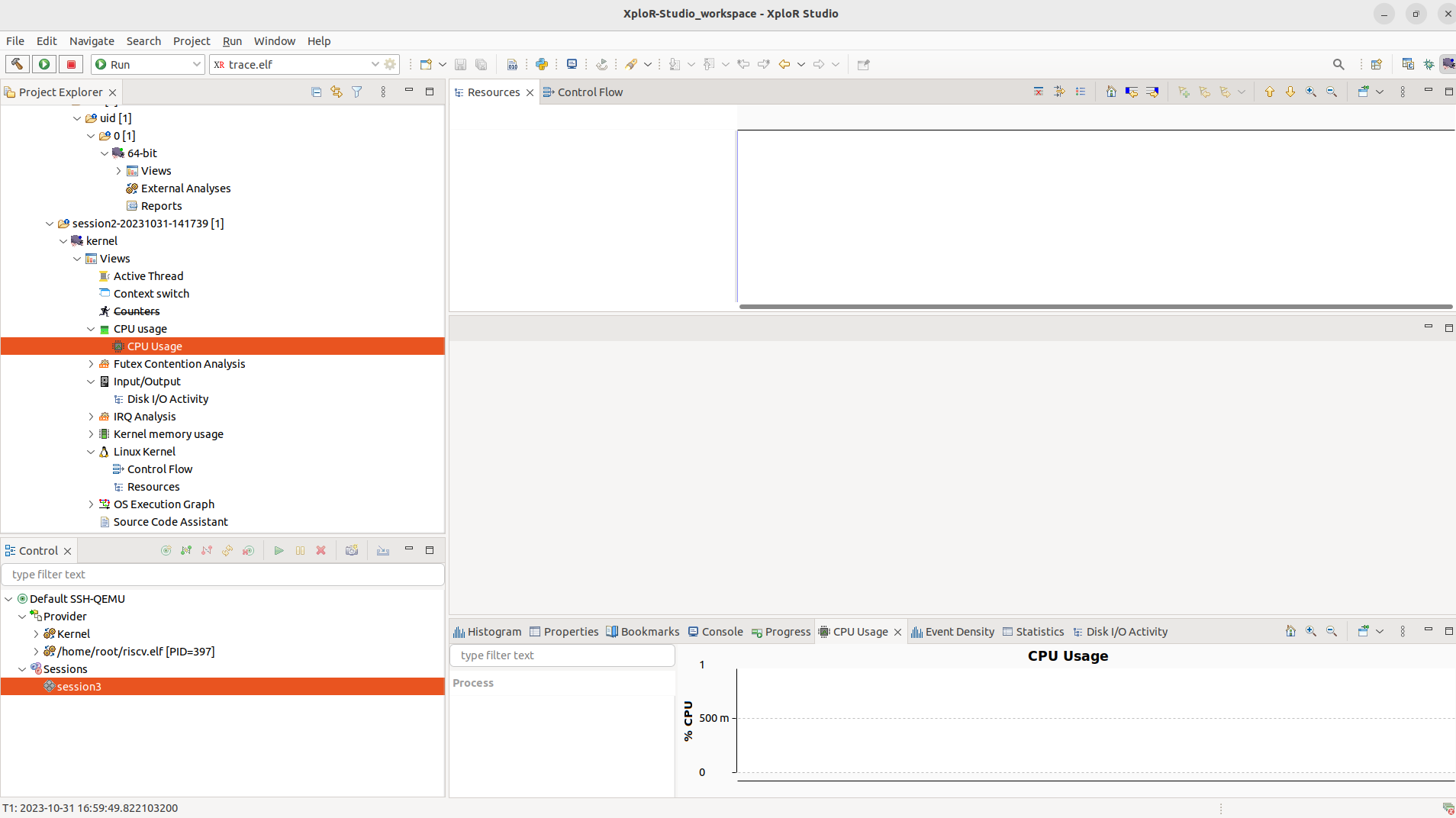
LTTng Kernel Traces (Project Explorer View, Events Editor, Histogram View, CPU Usage View, Disk I/O Activity View, Kernel Memory Usage View, Control Flow View, Resources View, …). Kernel does not have information that can populate a flame chart view.
LTTng-UST Traces (Events Editor, Flame Chart View, Flame Graph View, Function Duration Statistics View, Function Durations Distribution ViewProject Explorer View, …)
Event Editor
The Events editor shows the basic trace data elements (events) in a tabular format. The header displays the current trace (or experiment) name. In this case, it is Default…/kernel
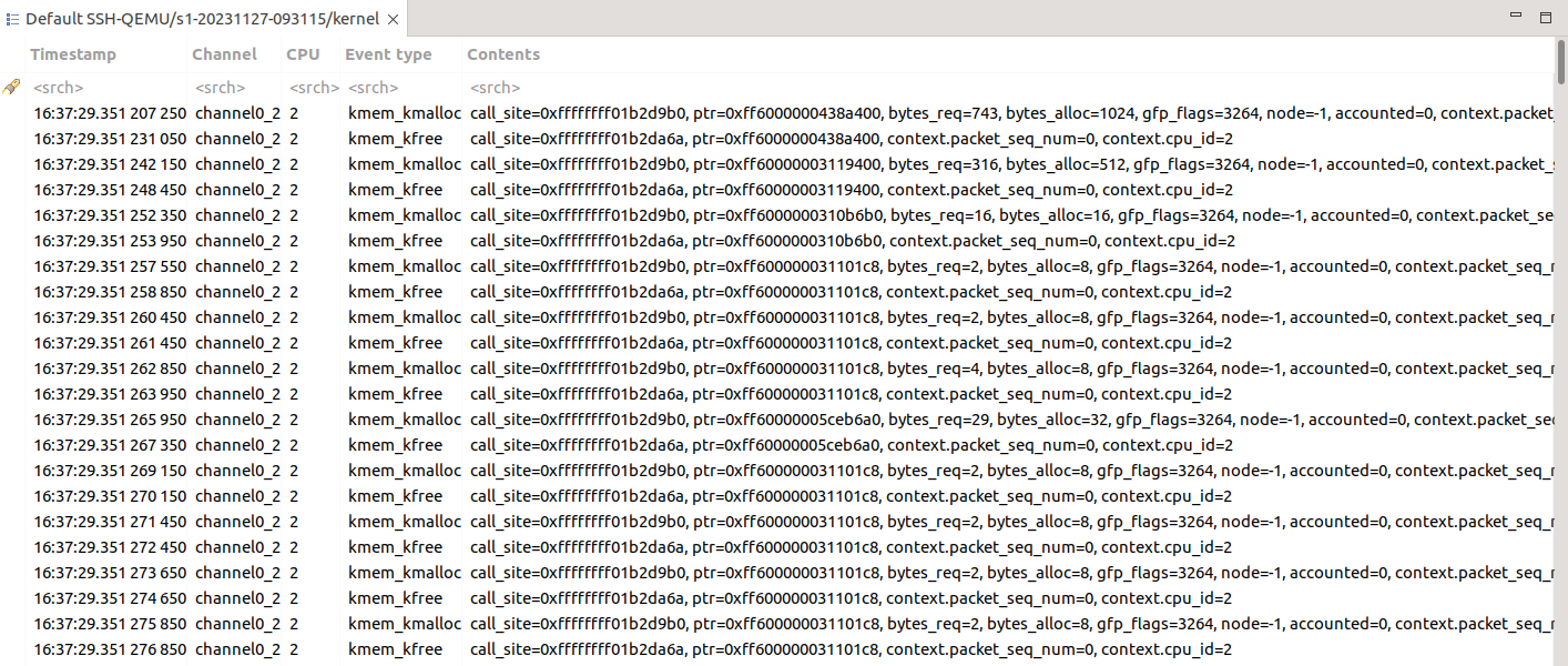
The columns of the table are defined by the fields (aspects) of the specific trace type (ust or kernel). These are the defaults:
Timestamp: the event timestamp
Event Type: the event type
Contents: the fields (or payload) of this event

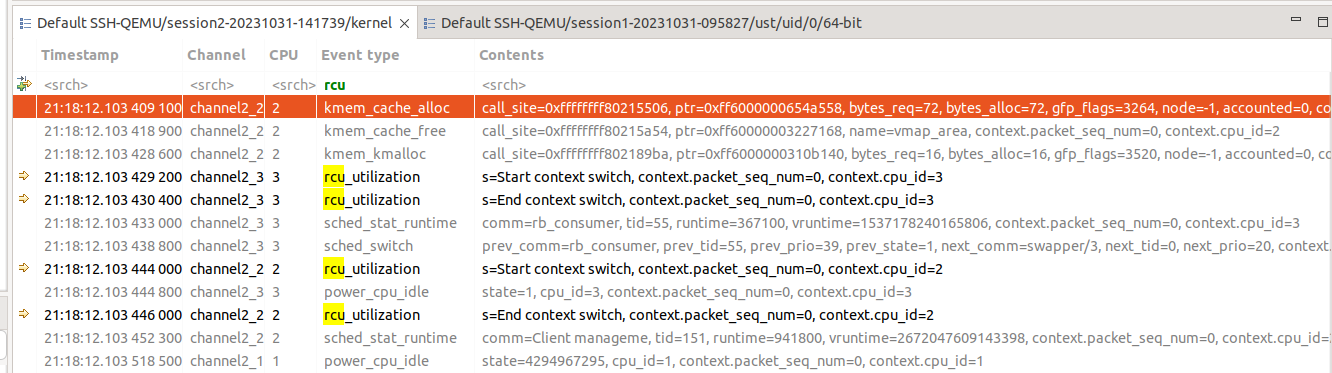
The highlighted event is the current event and is synchronized with the other views. If you select another event, the other views will be updated accordingly. The properties view will display a more detailed view of the selected event. For example:

An event range can be selected by holding the Shift key while clicking another event or using any of the cursor keys ( Up’, Down, PageUp, PageDown, Home, End). The first and last events in the selection will be used to determine the current selected time range for synchronization with the other views.
If the Event editor is closed, the views will display empty states. For example:
Searching and filtering
When a searching condition is applied to the header row, the table will select the next matching event starting from the top currently displayed event. All matching events will have a ‘search match’ icon in their left margin. Non-matching events will be dimmed. The characters in each column which match the regular expression will be highlighted.
Pressing the Enter key will search and select the next matching event. Pressing the Shift+Enter key will search and select the previous matching event. Press Esc to cancel an ongoing search.
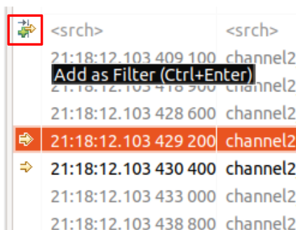
To add the currently applied search condition(s) as filter(s), click the Add as Filter button in the header row margin, or press the Ctrl+Enter key.
Press Delete to clear the header row and reset all events to normal.
Histogram View
 show the current selection time (or range).")
The Histogram View display the trace events distribution with respect to time.
The Align Views toggle button in the view menu allows to disable and enable the automatic time axis alignment of time-based views. Disabling the alignment in the Histogram view will disable this feature across all the views because it’s a workspace preference.
The Hide Lost Events toggle button in the local toolbar allows to hide the bars of lost events. When the button is selected it can be toggled again to show the lost events.
The Activate Trace Coloring toggle button in the local toolbar allows to use separate colors for each trace of an experiment. Note that this feature is not available if your experiment contains more than twenty two traces. When activated, a legend is displayed at the bottom on the histogram view.
On the top left, there are three text controls:
Selection Start: Displays the start time of the current selection
Selection End: Displays the end time of the current selection
Window Span: Displays the current zoom window size in seconds
The mouse can be used to control the histogram:
Left-click: Set a selection time
Left-drag: Set a selection range
Shift-left-click or drag: Extend or shrink the selection range
Middle-click or Ctrl-left-click: Center the zoom window on mouse (full histogram only)
Middle-drag or Ctrl-left-drag: Move the zoom window
Right-drag: Set the zoom window
Shift-right-click or drag: Extend or shrink the zoom window (full histogram only)
Mouse wheel up: Zoom in
Mouse wheel down: Zoom out
Hovering the mouse over an histogram bar pops up an information window that displays the start/end time of the corresponding bar, as well as the number of events (and lost events) it represents. If the mouse is over the selection range, the selection span in seconds is displayed.
In each histogram, the following keys are handled:
Left Arrow: Moves the current event to the previous non-empty bar
Right Arrow: Moves the current event to the next non-empty bar
Home: Sets the current time to the first non-empty bar
End: Sets the current time to the last non-empty histogram bar
Plus (+): Zoom in
Minus (-): Zoom out
Statistic View
The Statistics View displays the various event counters that are collected when analyzing a trace. The statistics is collected for the whole trace.
The view is separated in two sides. The left side of the view presents the Statistics in a table. The table shows 3 columns: Level Events total and Events in selected time range.
The data is organized per trace. After parsing a trace the view will display the number of events per event type in the second column and in the third, the currently selected time range’s event type distribution is shown.
The cells where the number of events are printed also contain a colored bar with a number that indicates the percentage of the event count in relation to the total number of events.
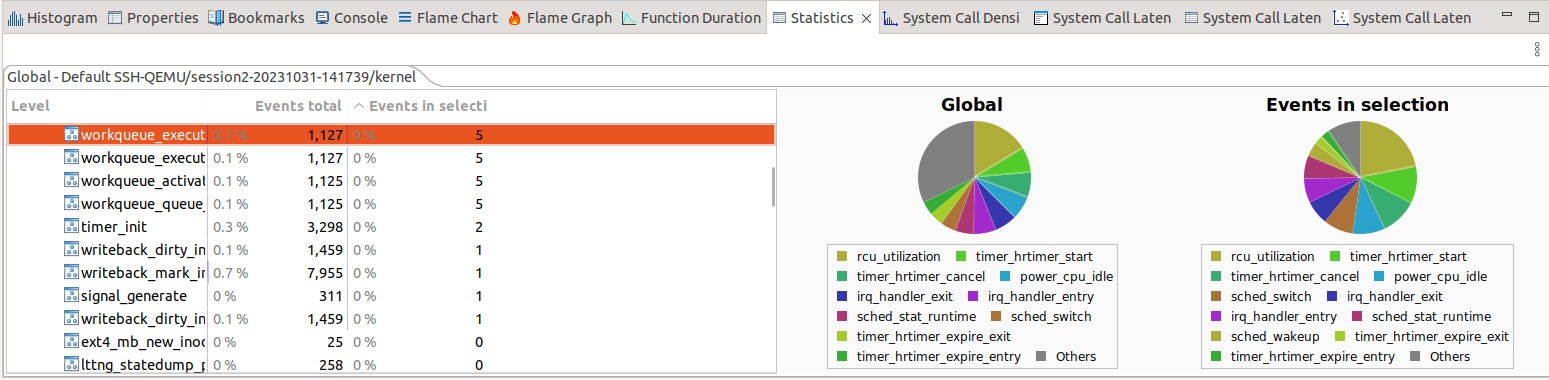
The right side illustrates the proportion of types of events into two pie charts. The legend of each pie chart gives the representation of each color in the chart.
The Global pie chart displays the general proportion of the events in the trace.
When there is a range selection, the Events in selection pie chart appears next to the Global pie chart and displays the proportion the event in the selected range of the trace.
CPU Usage View
The CPU Usage analysis and view is specific to LTTng Kernel traces. The CPU usage is derived from a kernel trace as long as the sched_switch event was enabled during the collection of the trace. This analysis is executed the first time that the CPU Usage view is opened after opening the trace. To open the view, double-click on the CPU Usage tree element under the Linux Kernel Analysis tree element of the Project Explorer.
Now, the CPU Usage view will show:
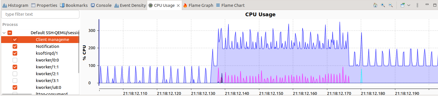
The view is divided into the following important sections: Process Information and the CPU Usage Chart.
Process Information The process Information is displayed on the left side of the view and shows all threads that were executing on all available CPUs in the current time range. For each process, it shows in different columns the thread ID (TID), process name (Process), the average (%) execution time and the actual execution time (Time) during the current time range. It shows all threads that were executing on the CPUs in the current time range.
CPU Usage Chart The CPU Usage Chart on the right side of the view, plots the total time spent on all CPUs of all processes and the time of the selected process.
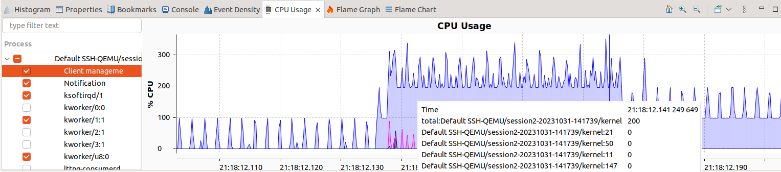
Tooltips Hover the cursor over a line of the chart and a tooltip will pop up with the following information:
Time: current time of mouse position
total: The total CPU usage
process: CPU usage of selected process
Kernel Memory Usage View
The Kernel Memory Usage View is specific to kernel traces. To open the view, double-click on the Kernel Memory Usage Analysis tree element under the Kernel tree element of the Project Explorer.
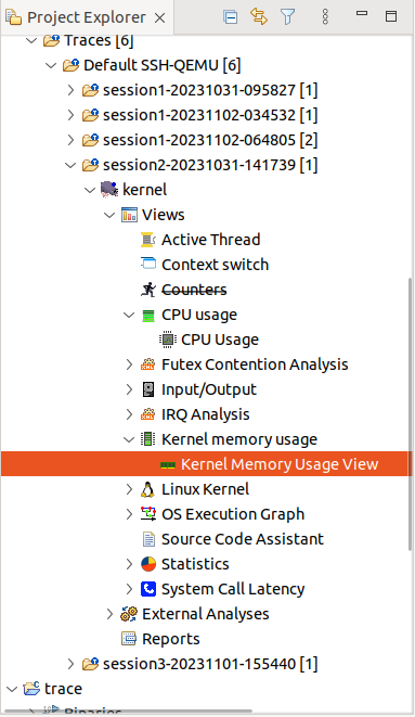
Now, the Kernel memory usage view will show:
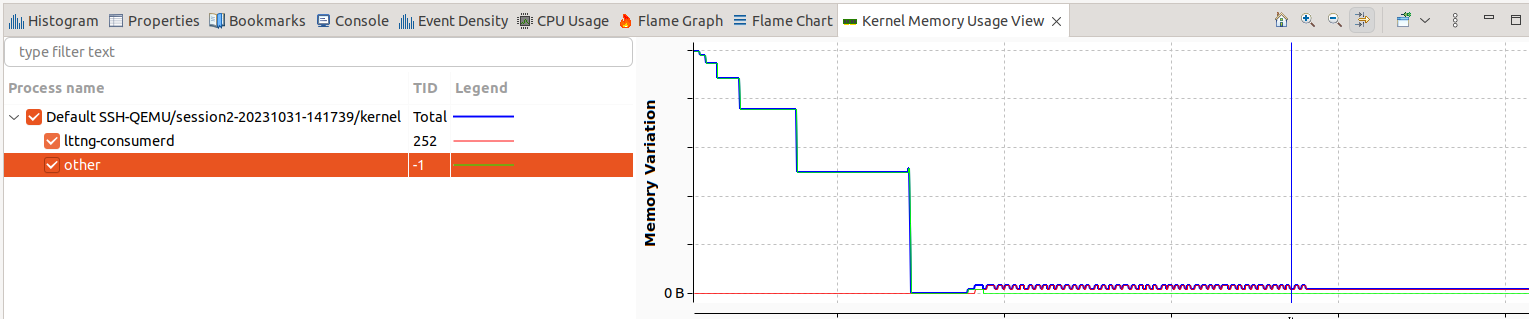
Where:
TID: The ID of the thread this event belongs to
Process: The process of the TID that belongs to it
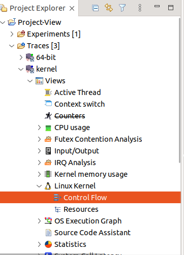
Control FLow View
The Control Flow view is a LTTng-specific view that shows per-process events graphically. The Linux Kernel Analysis is executed the first time when a LTTng Kernel is opened. After opening the trace, the element Control Flow is added under the Linux Kernel Analysis tree element in the Project Explorer. To open the view, double-click the Control Flow tree element.
You should get something like this:
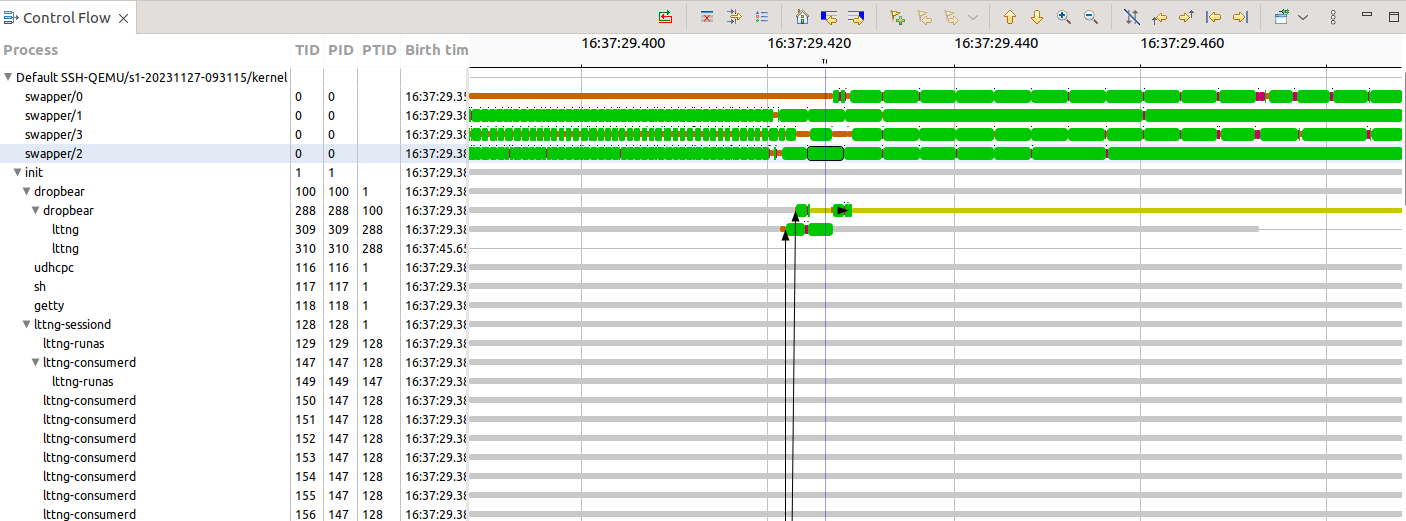
The view is divided into the following important sections: process tree and information, control flow and the toolbar. The following sections provide detailed information for each part of the Control Flow View.
Process tree and information
Control flow
Toolbar
Flame Chart View
The Flame Chart view allows the user to visualize the call stack per thread over time, if the application and trace provide this information.
To open this view go in Window -> Show View, if in the eclipse plug-in then click Other… and select Tracing/Flame Chart in the list. The view shows the call stack information for the currently selected trace. Conversely, you can select a trace and expand it in the Project Explorer then expand LTTng-UST CallStack Analysis (the trace must be loaded) and open Flame Chart.
Flame Chart View will show:
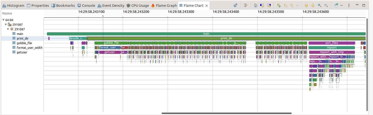
The Flame Chart View shows the state of the stack at all moments during the trace. That view shows for all threads of the application, the functions that were called, so it’s easy to see who called who and when.
Flame Graph View
This is an aggregate view of the function calls from the Flame Chart View
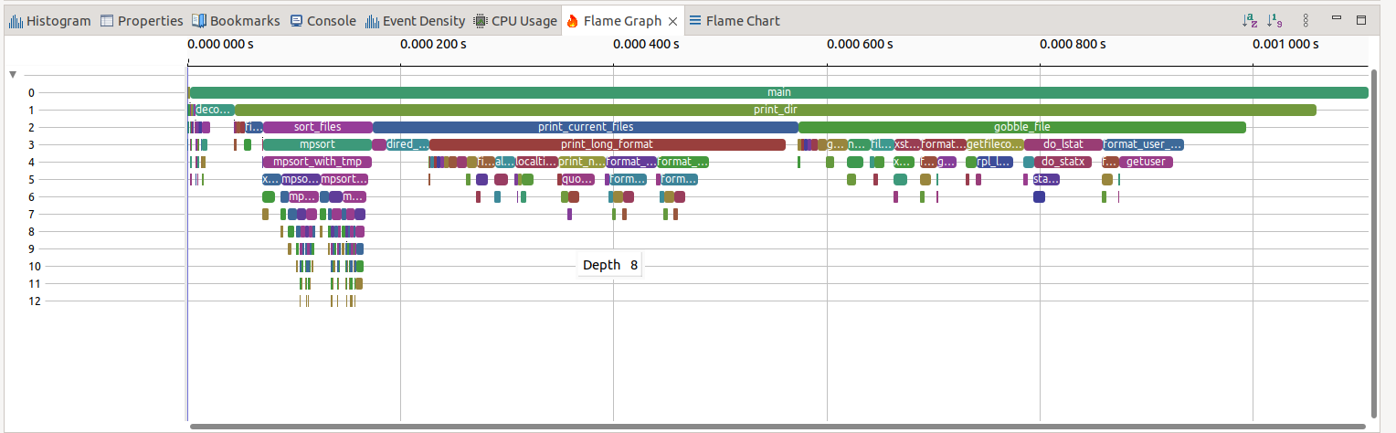
Each entry in the Flame Graph represents an aggregation of all the calls to a function in a certain depth of the call stack having the same caller. So, functions in the Flame Graph are aggregated by depth and caller. This enables the user to find the most executed code path easily.
The function name is visible on each Flame graph event if the size permits. Each box in the Flame Graph has the same color as the box representing the same function in the Flame Chart.
To use the Flame graph, one can navigate it and find which function is consuming the most self-time.
Each box represents a function in the stack (a “stack frame”).
The y-axis shows stack depth (number of frames on the stack). The top box shows the function that was on-CPU. Everything beneath that is ancestry. The function beneath a function is its parent, just like the stack traces shown earlier. (Some flame graph implementations prefer to invert the order and use an “icicle layout”, so flames look upside down.)
The x-axis spans the sample population. It does not show the passing of time from left to right, as most graphs do. The left to right ordering has no meaning (it’s sorted alphabetically to maximize frame merging).
The width of the box shows the total time it was on-CPU or part of an ancestry that was on-CPU (based on sample count). Functions with wide boxes may consume more CPU per execution than those with narrow boxes, or, they may simply be called more often. The call count is not shown (or known via sampling).
Function Duration Statistics View
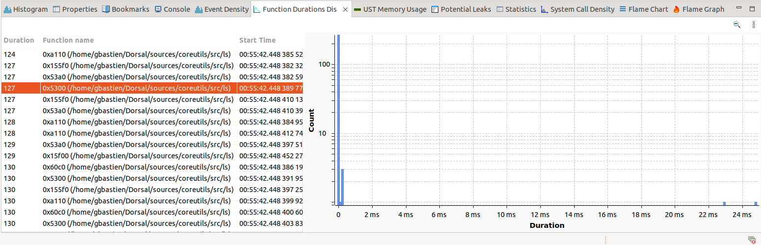
Function Duration Statistics View is a bar graph that shows the number of function calls with respect to their duration. The count is using a logarithmic scale. In this example it shows that very few functions takes longer than 0.5ms
Function Duration Distribution View
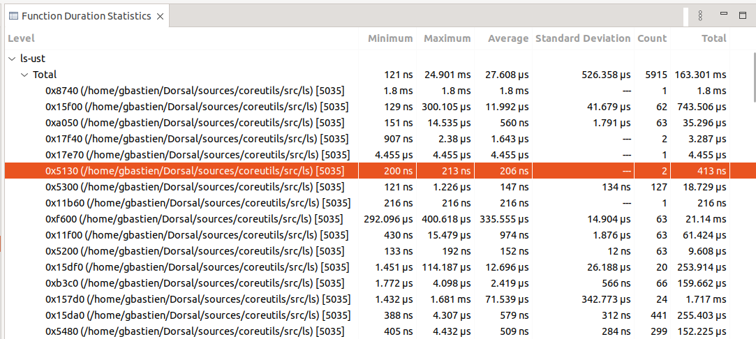
The Function Duration Statistics View is a table with each function’s minimum, maximum, average duration and other statistical parameters that may show that in certain cases, the duration can be bigger or lower depending on the context.
References
Trace Compass User Guide. Available at: https://archive.eclipse.org/tracecompass/doc/stable/org.eclipse.tracecompass.doc.user/User-Guide.html (Accessed: 08 December 2023).
Feedback
Was this page helpful?
Glad to hear it! Please tell us how we can improve.
Sorry to hear that. Please tell us how we can improve.